Sunday, 31 May 2015

Into the wilderness with Oak House Studio


Hi all iam just sharing my layout i made for the Oak House Studio blog. I have a full product list and step by step guide over on their blog right here. http://oakhousestudio.blogspot.co.uk/


                             I have used the Back to Basics true blue and Bohemian paper pack for this layout.


I have been playing around with silicon molds and they work really well with plaster. I love them as i can paint and distress the plain shapes.


I also like making my titles out of the craft foam as they are a lovely texture. Or maybe i am a bit strange?


Wednesday, 27 May 2015

Tando Creative May Challenge: Home Heart Wall Hanging

Hi all 
 I am back with another entry for the Tando Creative May Challenge. Ive been inspired by the Home Decor Week and all the DT projects so i have made this lovely wall hanging using the Home Heart Wall Hanging.


The Chipboard is very strong and hods paint and other mediums well. For the base i painted it with a layer of Artiste Lagoon Acrylic paint and the used crackle medium over the top and dried it off with a heat gun. i then painted over the top with Artiste Sea Spray Acrylic paint.


For the words i painted them with Artiste Avocado Acrylic paint and then a layer of crackle glaze and the use Artiste Sage Acrylic paint for the final coat.


I have decorated my wall hanging with paper flowers which i dyed using the DecoArt Acrylic misters. The Trimcraft paper flowers are the best because you get a variety of sizes in one pack.


I used the mini hearts as well and just painted them with purple and lilac paint. 


Thank you for visiting and for more product info visit  http://www.tando-creative.co.uk/catalog/

Tuesday, 26 May 2015

A bright spark in a dark world: introducing Trimcraft's latest Back to Basic range


Hi all
i am back with a few brightly coloured cards for the summer. Back to Basics Bright Spark is one of my favourites.


Try taking the decoupage toppers of the first layer to give them more flexability on your projects.


Ink drips add a bit of art to your cards. Just spritz across the card and hold it up allowing the ink to run down.


cut out elements from the packaging to make emebelushments. The butterflues are from the front cover of the 8x8 Bohemian pad.


Thanks for visiting.

Monday, 25 May 2015

Back to Basics with True Blue. Simple Boys cards

Hi all

Got a few cards to share from the True Blue range by Trimcraft. This range is great for boys cards and i will be back with a few layouts soon

               
                         A simple shaker card made using the stamp nesting die set and a bit of acetate. the stamp s from the Tiny Tatty Ted sentiments set


I have mixed the Belle and Boo decoupage pad in with the True Blue papers. Belle and Boo works with any of the ranges


A clean and Simple male card using a mixture of embellishments from the True Blue range

Thanks for visiting

Sunday, 24 May 2015

That Craft Place May Challenge Anything goes

                       
                             Hi all
Here is my first project as part of the That Craft Place Design Team. I am super excited to be working with the Mixed Media team for the next few months. you can play along with the challenge by following this link here http://thatcraftplaceblog.blogspot.co.uk/.


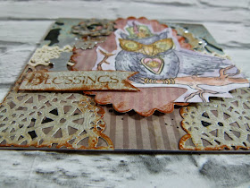
Here is my owl card i made using the Steam punk owl digital stamp from the That Craft Place  Etsy shop. I just coloured him in using Artiste Watercolor Pens and cut him out.


I used the Mirabell paper pad to create the layers on the card and spritzed with DecoArt black mister.


 I made the cogs using the First Edition dies and cut them out of silver card. i distressed them by rubbing Tim Holtz distress inks Rusty hinge and black soot over the edges.


                       Thanks for visiting and dont for get to join us on our Facebook  page
                               www.facebook.com/groups/271008489659989/

A burst of citrus with Oak House Studio


Hi all 
i am sharing a layout i made for my first Guest post over at the Oak House Studio blog. You can find a step by step guide and product list here www.oakhousestudio.blogspot.co.uk


Here are a few detail shots of the layout. I used the Bright Spark range by Trimcraft for the paper layers. I just cut several strips of paper and layered them.


To make a pin wheel take any square die and cut the sides upto the centre of the square but dont cut all the way through. Fold the opposite points into the middle.


Thanks for looking and please pop into www.oakhousestudio.com for more crafty goodies.

Thursday, 21 May 2015

Smeared and Smudged anything goes blog hop

hi all if you have popped in from the hop lovey to meet you and i will be hopping along in a bit. if you have stumbled across my blog you are also welcome to hop along with me so grab a cuppa or something stronger and lets get hopping.


I love to try out different things so i came across a shop that sells lots of different stamps and also Pagan greetings which you dont see very often.So this is the Green Man you will see him dotted about the old English architecture and hes a popular garden ornament but did you know that he is actually a symbol of rebirth?. I always thought he was some kind of guardian who watched over nature. The Pagan sentiment stamps are from Stamping Allday www.stampingallday.co.uk

The start of the blog hop is here

Black Dragon lynsblogger.blogspot.co.uk
Nan deepintothedarknesspeering.blogspot.co.uk
Teresa www.thefatcactus.co.uk
Leslie Rahye www.leslierahye.blogspot.co.uk
Anna chasingchaoticchaos.blogspot.co.uk
Tit Belsoeur www.titbelsouer.eklalog.com
Susan Renshaw www.susanrenshaw0404.blogspot.co.uk
Maureen www.maureenjscott.blogspot.co.uk
Jane www.jcocraft.blogspot.co.uk
Barbara www.blackholestudio.blogspot.co.uk
Susan S www.lilyandthelotus.blogspot.co.uk
Katie you are here
Shell www.happycraftershell.blogspot.co.uk
Donna www.donnamundinger-popsicletoes.blogspot.co.uk

Thank you for visiting and hope you have found us inspiring.

Wednesday, 20 May 2015

Tando Creative May Challenge


Hi all
I am sharing a new mixed media layout today. I am entering this one into the Tando Creative May Challenge.  www.tando-creative.blogspot.co.uk

  
I used the Harlequin and sequin waste masks on this project. I wanted a very textured layout that reminded me of all the things found when the tide goes out. Like the little crabs and limpets stuck to the rocks. 


These cute place markers are from the Happy Scatter Etsy shop, i love them and i want more.


I really do love being on the beach its so peaceful and the salty water and fresh air is invigorating.


I experimented with texture by adding seed beads to the page. I was trying to recreate the rough rocks you find when the tide goes out.

                       
                      And here are some beach photos to keep you going until the next holiday. I can still                             smell the salty air, i think i miss it already.


This is Weymouth which i have just come back from, i love this beach with its fine sand and shallow water.

 This one is Bognor regis while stunning to photograph its not so kind on the feet


Exmouth is one of our regular destinations its strange because the sand is light and fine here but less then a mile up the road the sand is a red colour, The red sand gives the place a surreal feeling and i love it.

Thank you for visiting and i will be back with more photos and projects soon

Trimcraft Scrapbook Feature May

Hi all
I am sharing my layout i made for the June scrapbook feature over at www.trimcraft.co.uk. pop in to see the full tutorial and other inspiration. www.trimcraft.co.uk


This is a photo of my Nan and Grandad on their wedding day. I created a frame using twine and pearls.


Here is a close up of the Keys die set and the Tag die set by First Edition.


I wanted to experiment with shaker boxes. The easiest way to create them is by using nesting dies.

       
Thanks for looking

Tuesday, 19 May 2015

A new mixed media layout and some sad news

Hi all some sad news
Scrapbook magazine is closing so i wont get to see my work published. I will be sharing the layouts i made for my introducing feature over the next few weeks starting with this one.

                       
                                I used the Sweet Paris range to make this vintage layout of my nan

 I spritzed Ayeeda misters over the base of the page first before stamping over the top with Kaisercraft texture stamps. This one is the Grid one.

i used an assortment of white paper flower and inked them to match the layout. I used OHS sepia ink.


Thanks for looking

Tuesday, 12 May 2015

Mirabelle card inspiration


Hi all
i am back with a new Mirabelle card. This is definitely one of my favourite ranges.


I love the amount of different bits this range comes with like the sparkly buttons and the ribbons.


Hatpins are newish to the Trimcraft ranges but i love them and hope we get lots of different ones to play with.


The topper is from the 8x8 decoupage pad and they are easy to assemble. I just follow the numbers on the sheet and build the layers up using the 3d foam pads.


Im off now for a bit but will be back Sunday with some news to share.

Thanks for visiting.

Sunday, 10 May 2015

A bit of Belle and Boo

Hi all 
i am back today sharing a few cards from the Belle and Boo range. 


I thought i would have a go at making a few cards suitable for little boys as its nice to have something a bit different from the usual cars and football cards.


I made these cards using the 8x8 decoupage pad which comes with all the pieces ready cut to save time. They are a bit like pringles once you pop you cant stop ha.

I love the bright colours of this range and the vintage images all make unusual cards.

Thanks for visiting

Wednesday, 6 May 2015

A Pop of Neon: Creativity Magazine issue 58

Following my first major feature in Creativity Magazine, i am now going to share my layout in more detail and give you a few tips on how to use this range.


Here a few tips

Do not be afraid to use bright colours such as neon. 
When used in the right quantity they can produce stunning effects. 
The Bare Basics Neon range was designed to compliment the existing Bare Basics products and works best with soft neutral colours. 
Tone down the brightness with kraft or black card stock.


I added texture to this layout by cutting out fancy boarders using boarder dies and Xcut boarder punches. Add dimension by layering them up by stacking 3d foam pads together.


I rubbed paint over white mulberry flowers so that the bright colours would not overwhelm the layout.


Use stamps to create embellishments by stamping them onto card and cutting them out. I made mini gringham stars by using the mini start palm punch and punching through the stamped image.


Thank you for visiting and you can read the full article and more in Creativity Magazine issue 58. Visit www.docrafts.com for more information.